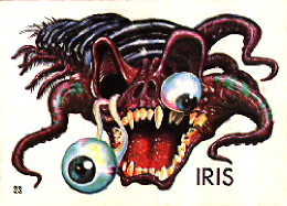
31 favorite monsters: Ugly Sticker #3
To this day, I have no idea how I got these awesome little weirdos. They just sort of turned up in a plastic bag in the basement of my old house, way back in 1997. At the time, I assumed they were just really cool, generic vending machine toys without any particular basis, but within my first few weeks on the internet in 1999, I stumbled upon a fansite for the Ugly Stickers, a collectible set of positively GORGEOUS monsters released by Topps in 1965, nearly thirty years before I was born. The site I found doesn't exist anymore, but the above link will take you to the official site by Norman Saunders, who co-designed the set with cartoonist Basil Wolverton!
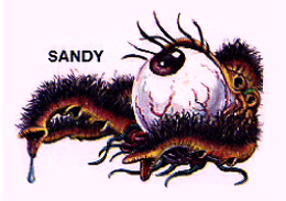
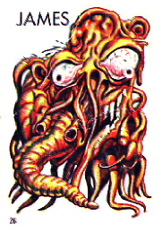
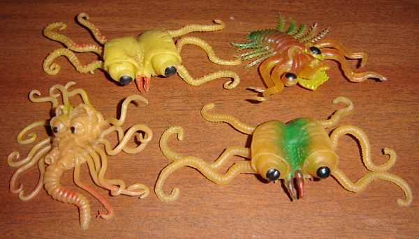
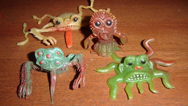
Every single one of the Ugly Stickers are pure monstrous brilliance, combining grotesque and otherworldly anatomy with a whimsical personality that makes even the most pestilent Ugly seem like a fun guy to hang out with. If you're familiar with any of my art, you can probably tell that these things have had an enormous impact on my design sensibilities.
While it should be fairly difficult to pick a favorite amongst all these hairy eyeballs and melting tentacle faces, it's good old #3 here that I find the most appealing. It's hard to explain what's so special about this one, really; everything about it just "clicks" for me. I like the fuzzy underbelly, the flattened two-lobed anatomy, the binocular-like eyeballs...it's all just incredibly cool and alien with a simple, compact little bug-blob shape. If I could have just one real-live monster for a pet, this thing would be HIGH on the list of contenders.
If you're wondering why I don't call hm by name, each sticker actually came with one of several possible names on them, so kids could harrass each other with hideous monster stickers on a more personal level.
posted by Scythemantis at
5:50 AM
![]()

4 Comments:
I need to see if I can get my hands on some of these... They're too awesome not to have.
#3 looks so familiar to me for some reason...I think it was in someone's sig on the Neocolors forum. (I was looking for the old Mutant Chia's poses and I found something completely different. :P)
I've got to say I find #12 and #18 the most disturbing by far, for the simple fact that they are clearly meant to evoke human heads, but warped and twisted in some horrific way. Of the two, whilst #12 has that disturbing tube nose arrangement, an unascertainable number of eyes (is there a third smaller eye on the far side of his head that we can't see?) and most grotesquely, greasy black hair, it's #18 that's the clear winner for me. He's a completely remolded human head: all the parts are present and somewhat recognizable, but pulled far out of their usual place and size. That's what makes these two so creepy, IMO, the element of the familiar in them. I dunno about you, but I find the idea that these guys may have once been regular human beings adds a whole new layer of delicious creepiness to their design.
It's kind of like an H. G. Wells Martian.
Post a Comment
Subscribe to Post Comments [Atom]
<< Home